Gimme just a little more love
I was pleasantly surprised to notice that SingPost SAM (Self-Automated Machine) has been upgraded. Since I had a bill to pay, I used it as my personal research into UX/UI.
Conclusion: little things make the experience wholesome.
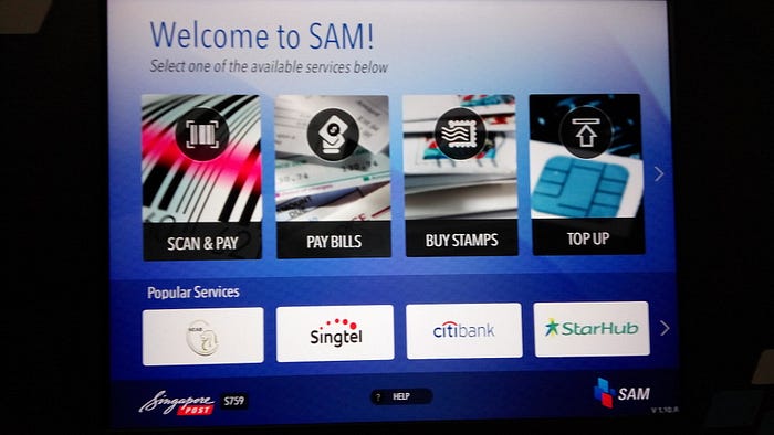
I could spot the service I was looking for (Pay Bills) at a glance though I wondered if ‘Scan & Pay’ was an actual service or a feature highlight. I also questioned the use of an exclamation mark after the welcome message and the redundant use of ‘available’ in the instructional copy.

Based on past experience, I knew that my utility bill would be under the category of ‘Telcos & Utility’. I tapped ‘Scan Your Bill’ without thinking. Now that I’m looking at this screen again, I wonder if perhaps only two choices were needed on this screen: ‘Scan your bill’ or ‘Manual entry’.

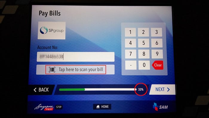
At this point, I wondered why ‘Tap here to scan your bill’ button was there because I assume an error in the scanning process would have prompted another page, right? Anyway, I do like the progress bar at the bottom, which I believe is a new addition.


When I saw ‘Done’ and knew that I have not paid, I realized that the progress bar was actually indicating the progress of the machine in recognizing the bill.

I can’t remember if I pressed ‘Done’ or is the screen automatically refreshed to this screen. The option to add more bills or other services to check it all out in one shot was a nice touch. This is not a new feature though.
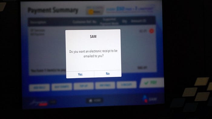
After pressing ‘Pay’, I was prompted with this eco-friendly message.
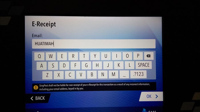
This is when the experience starts to get weary.
I would have preferred the virtual keyboard to be in a different configuration or be responsive to the function the user is performing.
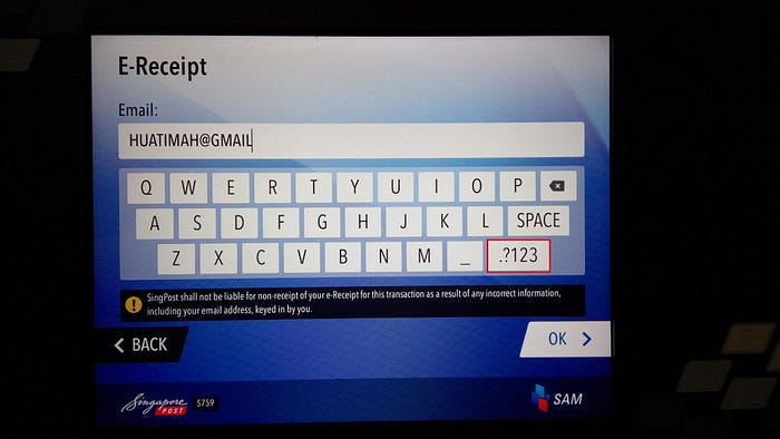
Just to key in the @ and the dot after ‘gmail’, you had to switch between the “.?123” and “ABC” key. This added at least four to five more steps to the simple need to key in my email address.
Furthermore, there is so much screen estate but this was taken up by a disclaimer which made them sound unfriendly and irresponsible.
Why bother with the disclaimer? It’s not as if they would ignore customer complaints if there were disputes in this matter. And how many such complaints were they anticipating to warrant such a disclaimer?
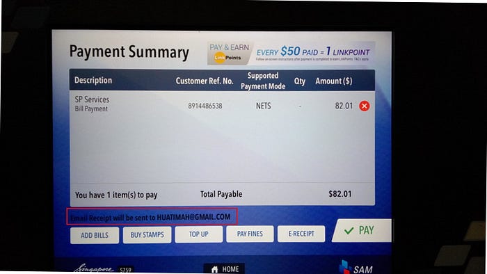
Finally managed to input my email address for an e-receipt and the response message was discreetly displayed in black on the bottom of the screen.
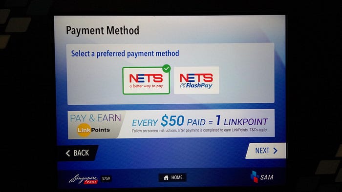
I chose to pay by NETS and was already alerted that I could earn LinkPoints when the transaction was completed. Good time to place such a message.
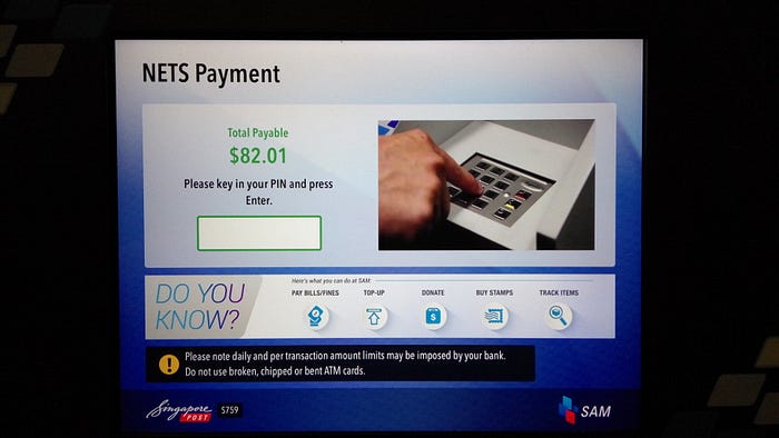
I didn’t understand why the banner here was about the service offerings. Perhaps the screen estate could be used for the ‘warning’ message below.
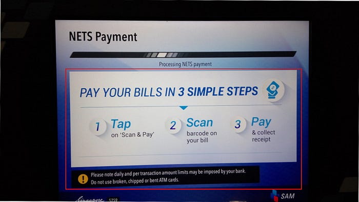
Again, there seemed to be ‘useless’ information here. My payment was already being processed so I’ve been through the ‘3 simple steps’ advertised.
Missed opportunity, from point of view of a content strategist.
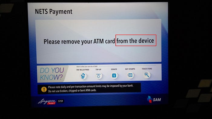
Now that the experience is less than perfect, I started to nitpick. Here again I noticed irrelevant banners, warning message and redundant words — “from the device”. Like where else would I be removing my ATM card from?

After the ‘Transaction Successful’ screen, I was led to the same horror of entering information using the same keyboard. I also wondered about the difference between ‘Back’ and ‘Cancel’. Perhaps the machine thinks I need to verify whether there were a ‘Transaction Successful’ screen.
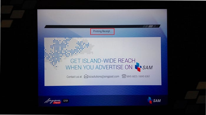
What happened to my eco-friendly choice of an e-receipt?
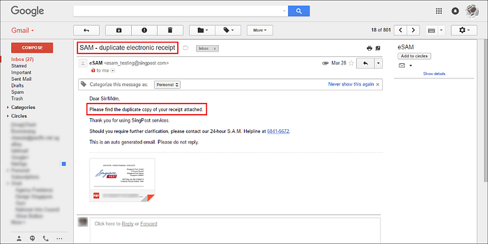
The machine automatically printed a receipt for me. Perhaps giving the user a choice would have been better. It was then that I realized that the e-receipt option was an ‘extra’ service and not a chance to be eco-friendly. This is confirmed in the following screen grab. #LOL
Conclusion
The experience started out promising but was marred by the virtual keyboard which made entering information cumbersome. After that, I became a spoiled brat user and started nit-picking.
The bad news is that customers are so hard to please.
The good news is that there is always room for improvement.
